The International Shark Attack File (ISAF)
Databases of all sizes are traditionally assumed to be the domain of industry and the private sector, especially in the age of the “Internet of Things [IoT],” where sensor data from different internet-enabled devices is stored in aggregated forms for picking apart by data scientists. However, museums, while normally thought of for collections-specific database information, have far more varied database types, including image and geographic databases, DNA sequence databases and, in the case of the Florida Museum, a database of shark attacks. For many years, the museum has maintained the International Shark Attack File (ISAF), a continually-updated resource of worldwide shark bite information, vetted by museum scientists (https://www.floridamuseum.ufl.edu/shark-attacks/about/isaf/).
As of late 2020, the ISAF has >6500 recorded cases. Each year, between 130 and 150 cases are reviewed, and between 60 and 70 vetted cases of unprovoked attacks are added to the database. The database includes information on the geographic location of the bite, the date, and the outcome (fatal / non-fatal). What can we do with a good-quality database like this? An example of a data science question in a museum context would be to ask whether we can develop a good classifier to predict whether, given specific input information, a shark bite is classified as fatal or not fatal.
This kind of output is known as binary data (“Non-Fatal” / “Fatal”). However, the ISAF classifies bites in multiple discrete categories. One of the first steps in data analysis is to transform information into a form that fits the question at hand, and a second step is to graphically explore the information.
Exploring the data
Data analysis of this sort is generally done in the R and Python environments. By “environments,” I mean frameworks that accept programming scripts, which are lists of commands invoked to generate outputs such as graphical plots and statistical analyses.
Python is more flexible than R in many ways, but for graphical exploration, R has much better libraries (sets of functions designed around a designated purpose), so we will begin with R, and load a large number of R plotting and data processing packages, such as ggplot2, gganimate, gsubfn, and rnaturalearth.
With this background loaded, we can read in the ISAF dataset, and do the preprocessing to transform the data into a form amenable to the data science question. Specifically, we will convert multiple discrete outcomes to the binary outcome (and also group by the year that the attack took place). It is worth noting that the R commands presented here are NOT length optimal!
data <- read_excel(“~/Documents/gavin/maps/50yrslatlong.xlsx”)
sorted <- data %>% filter(!is.na(latitude)) %>% filter(!is.na(longitude)) %>% dplyr::group_by(Year) %>% arrange(Year, .by_group=TRUE)
outcome.names <- unique(sorted$outcome)
reduced.vec <- c(“Non-fatal”, “Fatal”, “Fatal”, “Fatal”, “No Data”, “Fatal”, “Fatal”, “Fatal”)
names(reduced.vec) <- outcome.names
sorted$class.val <- gsubfn(“.*”, as.list(reduced.vec), sorted$outcome)
We want truly binary classification, but there are three examples for which we know a bite occurred, but do not know the outcome:
which(sorted$class.val == “No Data”)
## [1] 19 171 2041
so we remove these three entries before proceeding:
sorted <- sorted[-which(sorted$class.val == “No Data”), ]
Now that the transformed data are stored, we can create and store a basic world map for the dataset:
theme_set(theme_bw())
world <- ne_countries(scale = “medium”, returnclass = “sf”)
base.map <- ggplot(data = world) +
geom_sf(lwd=0) +
xlab(“Longitude”) + ylab(“Latitude”)
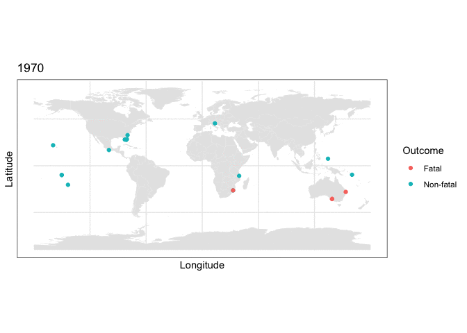
and we can use this stored map with some clever R plotting features to generate an animation of the cumulative set of shark attacks from 1970 to 2020, with prior years more transparent than the currently displayed year:
full.map2 <- base.map + geom_point(data=sorted, aes(x = as.numeric(longitude),
y = as.numeric(latitude), color=class.val)) + scale_color_discrete(name = “Outcome”) + labs(title = “{closest_state}”) + transition_states(as.integer(Year), transition_length = 0, state_length=4) + shadow_mark(alpha=0.15)
Animating the above yields:
animate(full.map2, nframes=400)
What the plotting tells us
Two things are immediately apparent in the above plot:
- The dataset appears to be imbalanced, as there are noticeably more non-fatal than fatal attacks recorded.
- There appears to be geographic clustering in the number of fatal (red) cases, with many occurring along the coasts of populous regions.
So, we have some structure to work with. The question, now, is whether we can develop a model that will exhibit good fit to this dataset. It turns out, yes.
Fitting a model
To fit a machine learning model to this dataset, we will switch to a Python implementation of Apache Spark (PySpark). In order to make PySpark commands legible in RStudio (where this document was created via RMarkdown), the reticulate package must be loaded. (Note: the model discussed below is presented as a conceptual learn-along, and the results presented in their current form are not intended for definitive use by media or academic outlets.)
We begin by loading what PySpark needs to run machine learning operations:
from pyspark.sql import SparkSession
from pyspark.sql.types import IntegerType, StructType, StructField, DoubleType
spark = SparkSession.builder.getOrCreate()
df = spark.read.format(‘csv’).options(header=’true’).load(’50years_version5.csv’)
df = df.withColumn(“Year”, df[“Year”].cast(IntegerType()))
df = df.withColumn(“latitude”, df[“latitude”].cast(DoubleType()))
df = df.withColumn(“longitude”, df[“longitude”].cast(DoubleType()))
df = df.withColumn(“class”, df[“class”].cast(IntegerType()))
df.createOrReplaceTempView(‘df’)
In the above, we have loaded a pre-prepared version of the ISAF dataset (in comma-separated [CSV] format), and have stored it as a PySpark DataFrame.
Next, what we want to do is abide by good data science protocols and randomly split the dataset rows into a training dataset, on which we fit a model, and a test dataset, on which we test the fit of the inferred model. It is important to split the dataset randomly, so as to avoid possible covariation among adjacent rows that would affect model inference! The test dataset functions as an “independent” source of data that has not informed model training. What this means, practically, is that if the model exhibits similar performance on both training and test, then the model has not centered in on exactly fitting the existing data (training) to the exclusion of future data (test) that might be different. Therefore, if we give the model new data, it may perform well predicting outcomes of unprovoked shark attacks, given input data. We want models to be outward-looking, as well as case-fitting.
Toward this goal, when assessing model performance, there are a few key features to keep in mind:
| Training | Test | Meaning |
| Good | Good | Adequate |
| Good | Bad | High variance / overfit |
| Bad | Bad | High bias / underfit |
| Bad | Good | possibly nonrandom partitioning of training and test, or goblins (step away from the computer; something went wrong) |
We will also load packages related to Spark pipelines, which are a way to set up data preprocessing and analysis steps in a modular way, and have a look at the first 20 rows of the dataset.
from pyspark.ml.feature import StringIndexer
from pyspark.ml.linalg import Vectors
from pyspark.ml.feature import VectorAssembler
splits = df.randomSplit([0.8, 0.2])
df_train = splits[0]
df_test = splits[1]
df_train.show()
## +—-+———-+———–+—–+
## |Year| latitude| longitude|class|
## +—-+———-+———–+—–+
## |1970|-35.524776| 138.772478| 1|
## |1970|-27.998365| 153.434029| 1|
## |1970|-26.358405| 32.980957| 0|
## |1970|-26.358405| 32.980957| 1|
## |1970|-20.424075|-143.563733| 0|
## |1970| -9.9599| -150.2053| 0|
## |1970| -9.935966| -150.21356| 0|
## |1970| -9.64571| 160.156194| 0|
## |1970| 7.475005| 134.44562| 0|
## |1970| 16.7661| -99.79| 0|
## |1970| 27.7009| -81.2184| 0|
## |1970| 27.9743| -82.8317| 0|
## |1970| 28.3164| -80.6005| 0|
## |1970| 32.692277| -79.851379| 0|
## |1970| 45.3149| 13.5576| 0|
## |1971|-41.988894| 146.601563| 0|
## |1971|-34.184406| 22.159581| 0|
## |1971|-34.142943| 18.435925| 0|
## |1971|-33.859484| 121.898141| 0|
## |1971| -23.8785| 151.2872| 1|
## +—-+———-+———–+—–+
## only showing top 20 rows
Next, we assign the values for the pipeline to be optimized. One of these values is the actual model we will train on the data.
What model?
In data science, there are many kinds of classification models. Traditional methods include logistic regression and support vector machines (SVMs). More advanced methods include approaches with increasingly abstract and/or fitness-supplement-sounding names, like Random Forest (“Till Birnam wood come to Dunsinane”, anybody?) and Gradient Boosted Trees (one modification of which is named “XGBoost,” and yes, the “X” does stand for “Extreme”). Such names in this case are apropos, because Gradient Boosting can produce quite swole models. Gradient Boosting is also effective for classification problems with imbalanced groups, as we observed to be the case for shark attack outcomes in our initial data exploration. As there are significantly more non-fatal than fatal bites, we will use a gradient boosting method, here.
After loading these components and assembling the pipeline, we can initialize the model:
vectorAssembler = VectorAssembler(inputCols=[“Year”, “latitude”, “longitude”],
outputCol=”features”)
from pyspark.ml.classification import GBTClassifier
gbt = GBTClassifier(labelCol=”class”, featuresCol=”features”, maxIter=10)
from pyspark.ml import Pipeline
pipeline = Pipeline(stages=[vectorAssembler, gbt])
fit this model to the training dataset, and generate the predicted values we need to assess model performance:
model = pipeline.fit(df_train)
prediction = model.transform(df_train)
Now that the gradient boosted model has been fit, and predicted values under that model have been generated, we can explicitly quantify how well the model did at classifying shark attack outcomes. Did the prediction of a fatal, or nonfatal, bite match what actually happened? Did the model get it wrong? If so, how often?
Model performance
In data science, there is a 2x2 matrix, called the confusion matrix (which is either a very accurate summary statement about 2020 as a year, or an excellent band name). This matrix forms a conceptual basis for performance measures of many classification problems:
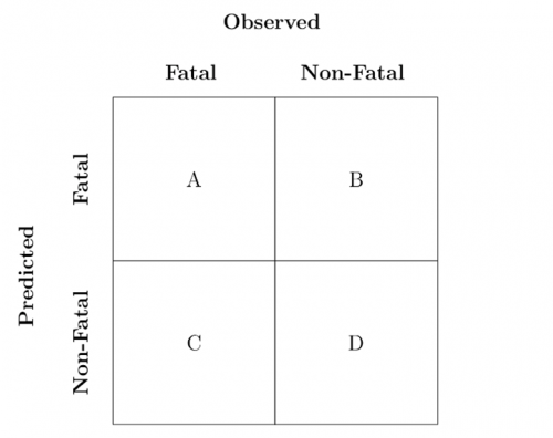
In the above matrix, the sum of A,B,C,D
equals the total number of rows in the dataset, A and D are the counts of true positives and true negatives, respectively, C is the count of false negatives (incorrectly labeled false), and B
is the count of false positives (incorrectly labeled as true). The literal translation of the above in our case is:
- A is the number of fatal attacks the model prediction classified correctly
- D is the number of non-fatal attacks the model prediction classified correctly
- C is the number of fatal attacks the model prediction classified as non-fatal
- B is the number of non-fatal attacks the model prediction classified as fatal
There are several major measurements used in data science when assessing classification performance:
- Accuracy, which is the proportion of all calls the model got right: A+B+C+D
- Precision (P), which is the proportion of true positives in all predicted positive calls: A+B
- Recall (R), which is the proportion of true positives called correctly: A+C
- F1 score, which is a kind of measurement that balances features of precision and recall together: 2*(P*R)/(P+R)
We will use the F1 score, here.
from pyspark.ml.evaluation import MulticlassClassificationEvaluator
multi = MulticlassClassificationEvaluator().setMetricName(‘f1’).setPredictionCol(‘prediction’).setLabelCol(‘class’)
multi.evaluate(prediction)
## 0.909124270698348
Because I have not set a random seed, the number for F1
will vary a bit, but after a few iterations, it appears that the score on the training dataset is around F1≈0.86. Given that the range of the F1 score is [0,1], with a maximum value at 1, this is tentatively good news!
But now we need to run this fit model on the test dataset, as well:
prediction_test = model.transform(df_test)
multi.evaluate(prediction_test)
## 0.8637304134837995
In this case, the score on the test dataset is F1≈0.86, so the two values appear to be similar enough to suggest the model has good fit.
Caveat Emptor

Given the above, it may be assumed that the model is ready to apply to data of interest (say, points in the past, or future; or points in different geographic regions that may not have easy reporting access to document shark attacks). However, intrepid readers will note that this model has been fit with spatial coordinates and years only. This fact makes it quite cool that the model performance is what it is, but shark attacks are not so deterministic. For example, being one mile south-south-west, versus half a mile due south, off the coast of Oaxaca, Mexico does not determine what will happen, should you be bitten by a shark while swimming. There are significant biotic and oceanographic factors to consider, and these factors contribute significantly to dataset robustness and model predictive ability. Unfortunately, the ISAF database has only partial data on biotic factors. While the gaps may be filled in by interpolation (using relationships among the data that is present to predict values in the empty cells), such gaps must usually be a small fraction of the overall data. Interpolation makes additional assumptions about data structure, and so we have not incorporated that information into this model.
(Note: the harbor seal image was modified from the original found at https://www.mysticaquarium.org/wp-content/uploads/2017/06/Harbor-Seal-Happy-Banana-Pose.jpg, dated June 6, 2017.)