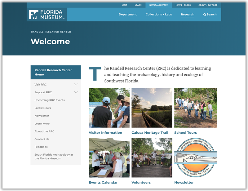
The Randell Research Center is the next major site to be migrated in to the new design template. We timed this to coincide with their new initiative to maintain a Facebook presence so anything they linked to would look appealing and pull the proper images for social media sites to display. They were also happy to have a calendar for their site to showcase all of the tour and school group offerings.
The RRC is also a good study into listening to user feedback. Unlike most sites, the RRC does not feature a large “hero image” for their header. This is because RRC staff found that users were navigating away to the Museum’s Visit page rather than looking at the RRC’s visitation information. (This has always been a challenge to provide the RRC a website for their visitors while still being included under the museum’s umbrella.) The RRC staff were concerned that their mostly older audience was getting confused. We decided to remove the main header image, drastically reduce the amount of text on the page and add a grid of “action item” images/links on the homepage for their most common pages. After these changes the complaints stopped. While beautiful imagery may go a long way to set the mood/tone of a site, practical usability is much more important!
https://www.floridamuseum.ufl.edu/rrc/
