The Office of Museum Technology is excited to announce the launch of a new Analytics system for FM Workorder. This subsystem is housed within the FM Workorder application and uses live system data to provide charts and reports to museum team members with Manager or Request Triage access for at least one work department. You can find an overview of the variety of charts and features as well as how to access them below.
This Analytics interface can be found by those users who have the correct affiliation by clicking the Navigation bar item labeled “Analytics.”
Disclaimer: These screenshots were taken using data from a development environment and have been stripped of datapoints that could identify the source work department(s) so as not to give a false impression of the workloads and/or activity of any of our hard-working department teams.
Dashboard
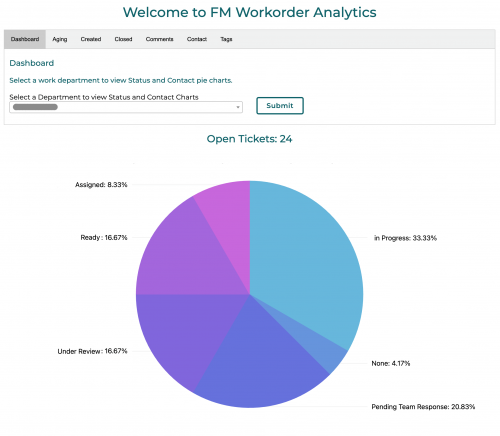
The Dashboard Tab contains pie charts that correlate to open tickets for the selected work department, with slices representing the numbers of tickets of a given status (pictured above), as well as time without worker contact (not pictured). These slices can be clicked to link managers to lists of open tickets matching the selected status or contact time, respectively.
Aging
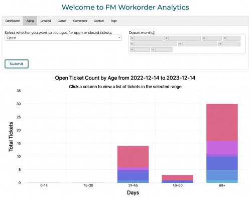
The Aging Tab contains a histogram that groups tickets into stacked columns by age in days. Filtering to “Open” tickets will show active tickets which were created as many days ago as their column represents, while selecting “Closed” will show tickets based on how old they were at closure. These stacks’ colored segments correlate to the selected department(s) and can be toggled by clicking the colored square in the chart legend. Clicking a stacked segment will link the user to a list of tickets matching the conditions of the clicked column.
Created
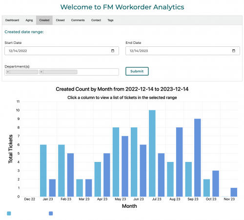
The Created Tab contains a bar chart (pictured above) that groups tickets by the month they were created. Like with the Aging Tab’s histogram, clicking a colored square in the legend will toggle the display of data from that department, and clicking a column will link the user to a list of tickets matching the conditions of the clicked column. When multiple departments are selected and/or when tickets that match the provided filters came from different buildings, this tab will also display pie charts showing a breakdown of tickets proportional to the departments and/or buildings they came from, respectively (not pictured).
Closed
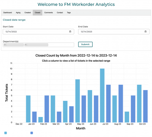
The Closed Tab is much like the Created Tab, though these tickets are exclusively those which are currently marked as closed, and are grouped by the month in which they are closed. Just like the Created Tab, the chart columns are toggle-able and click-able.
Comments
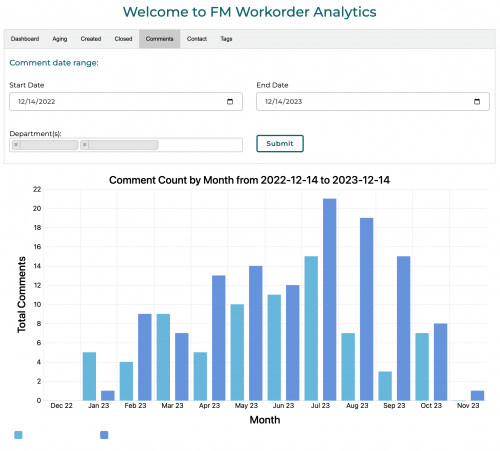
The Comment Tab also displays a bar chart (as pictured above), though this one displays the number of comments made on all tickets in a given range and department(s). This includes both open and closed tickets, and comments made by both request owners and team members, in an attempt to capture engagement between owners and workers.
Bucket Queue
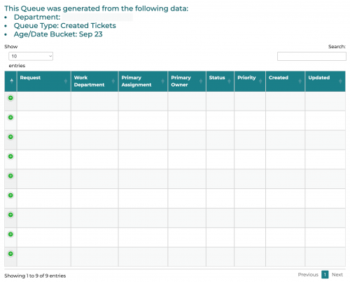
The Bucket Queue is not a tab within the main Analytics screen, but is instead a separate queue, populated by tickets that are filtered based on which segment/column was clicked in the Aging Tab histogram or Created/Closed Tab bar chart, respectively.
Contact
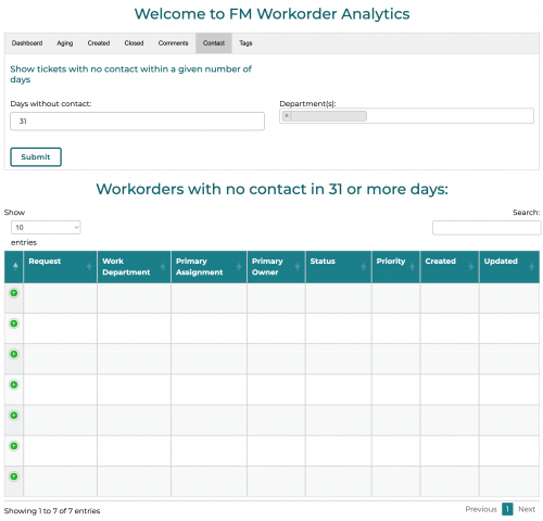
The Contact Tab outputs a list of tickets for the selected department(s) who have gone the given number of days (or more) without contact from a team member in that department. This allows managers and triage handlers to quickly assess and/or check-in on any tickets that may have fallen behind.
Tags
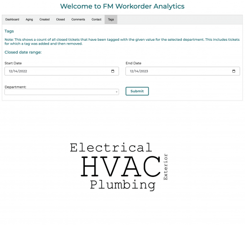
The Tags Tab is unique, in that rather than displaying a chart and/or list, it displays a weighted word cloud for a single selected department. The size of each tag corresponds to the number of Closed tickets in the provided range which were tagged with each of the displayed topics for a given work department.