Happy 100 years, Florida Museum! As part of our centennial celebration year, we’ve been working on a complete website redesign. And we mean ‘complete’! From the URL down to the software.
You’ve already been seeing our new Florida Museum logo popping up around the web. Simple, sophisticated, and flexible. And that’s how we approached our website redesign. It has to be easy to use, functional, and attractive.
The rules
The first thing we did was sit down and think about the big questions and how we would stay focused on the most important reasons for the redesign. After all, once your site starts looking pretty, it’s easy to get distracted with making it even prettier.
But we decided these two things must be first in every decision we had to make:
- Mobile-first
- Data-driven
More and more of our visitors are visiting our site from mobile devices (smart phones and tablets), so the site had to work the best and look the best on smaller screens. And it had to work for big fingers on tiny touch screens.
Also, we knew every decision we made had to be data-driven. We might like having a certain page on our site, but if only three people a year saw it, why maintain it? We might like the navigation structure of our site, but if it was confusing to our visitors and they couldn’t find their way around, it had to change. Fortunately we had Google Analytics and other reports to comb through for data to drive our decisions.
These two things were in the center of our white board the entire year of redesign.
Change of address
Typing www.floridamuseum.ufl.edu is slightly longer than typing www.flmnh.ufl.edu. But try saying that out loud to someone. FLMNH has been our informal nickname for years, but it is also hard to say and can be spelled in several ways (FMNH? FlaMNH?) so the museum is trying to phase out the use of the acronym entirely in favor of ‘Florida Museum’ instead.
Floridamuseum.ufl.edu is easier to say and read. Don’t worry though. All of those old flmnh.ufl.edu links will still find their ways to our new URL because we have several computer geniuses on our team.
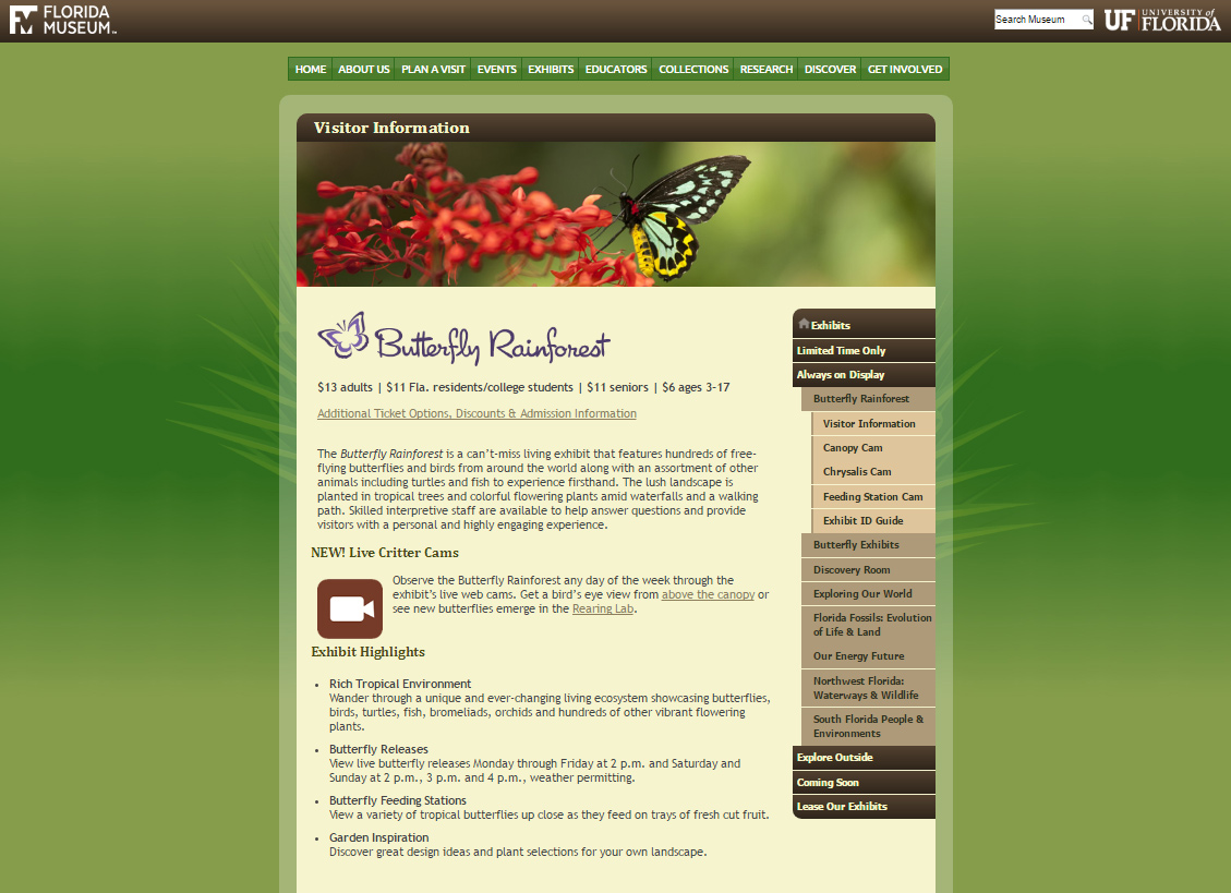
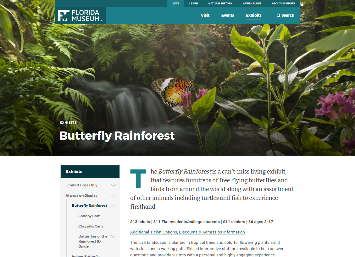
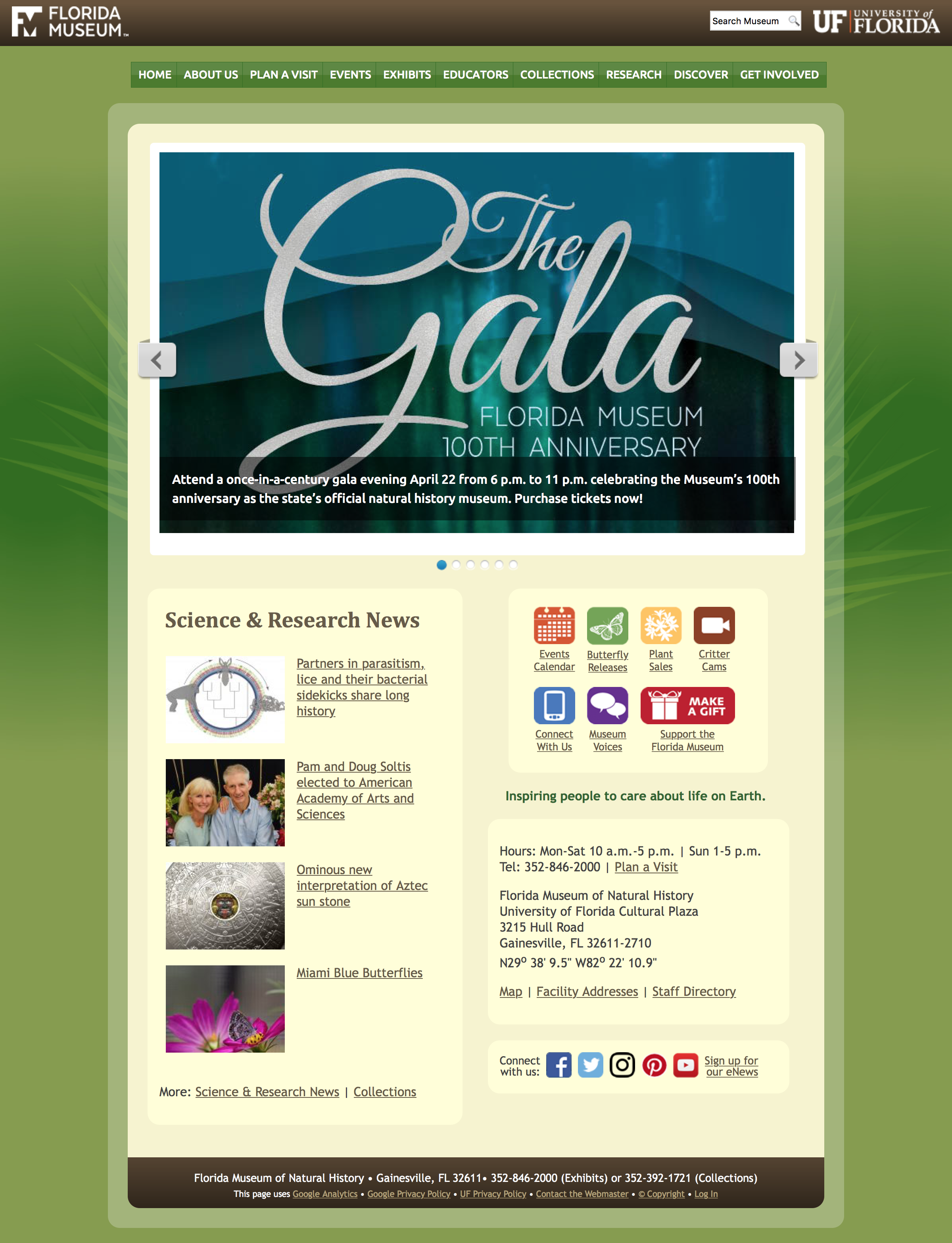
It’s so gorgeous
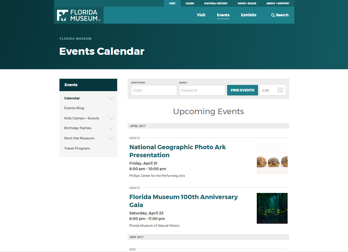
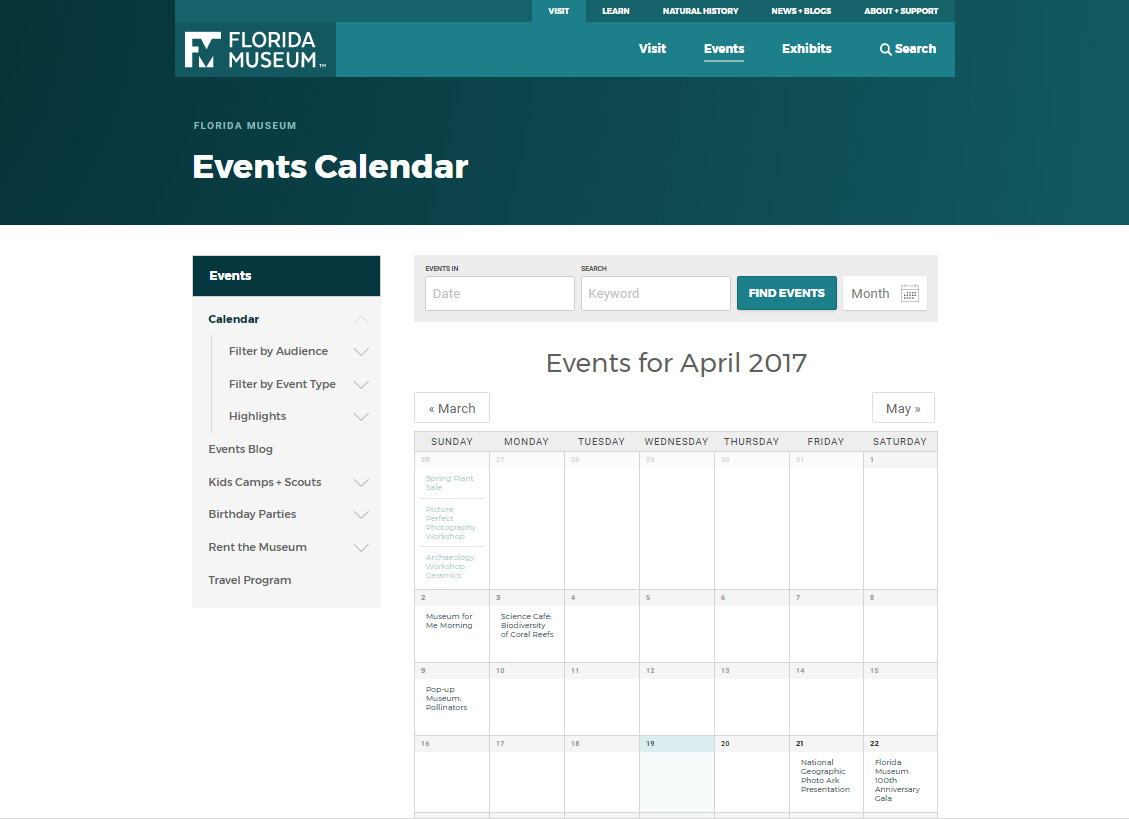
The most striking change for most visitors is going to be how the site looks. Our older design, with green background and rounded frame, was gorgeous five years ago when we introduced it. We think the new look is much more 2017. It has lots of full-size images and a clean white background. Moving away from our ‘nature green and brown’ colors, we’ve picked up more jewel colors like the teal blue of our main navigation bar.
We have so many gorgeous photos—from events and exhibits to specimens and artifacts—that we decided to bring them out for everyone to enjoy. Most pages have a lovely header image, and a lot of pages have body image or photo galleries.
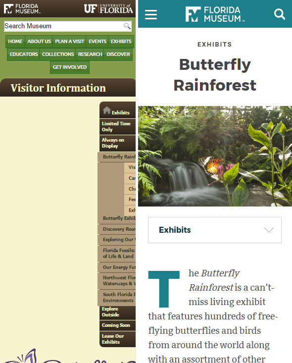
Phone-friendly
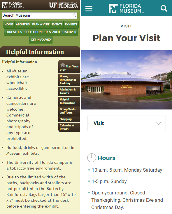
One of the biggest changes we’ve made is that our new site is intentionally designed for mobile devices. And it also looks good on a desktop/laptop. The previous design worked on a smart phone (mostly), but it was far from ideal because it was designed before smart phones started to dominate internet browsing.
Now we’re getting days where more than 50% of our visitors are seeing our site on a smart phone. More if you add in tablets, fablets, and all of the other ‘mobile devices’.
We also changed our site structure to serve mobile users better. Instead of clicking one page to look at hours and entrance fees, and then another page for directions to the museum, we’ve put most of the information you’ll need to know to plan your visit on one page. Why click multiple times when you can just swipe your finger down a page and scan for the info you need?
We were able to condense pages to the point that we cut about 100 pages from our main site without removing any information.
Not quite done
Not all of our sites have moved to the new design. Don’t get nervous if you navigate to a section that has the old design on it. Under the hood we’ve had to change the site to run on different software, which meant migrating each page into the new CMS (content management system). We’ve got a LOT of pages.
So for this initial redesign launch, we brought over most of our main site, and we’re queuing up the rest of the site to move over in parts. You might find that visiting the collections sites, like Ichthyology or Vertebrate Paleontology are still their old selves. But over the summer, we’ll finish moving the rest of the museum site into the new design. Stay tuned!
Comparing old and new: