![]() A birthday year ending with a zero or two often leads to reflection on the past and thoughts and dreams of what the future holds.
A birthday year ending with a zero or two often leads to reflection on the past and thoughts and dreams of what the future holds.
The Process
The Museum began planning in 2015 for its 100-year anniversary in 2017 as Florida’s official state natural history museum. The discussion included thoughts of a new logo, and the Museum communications team conducted extensive research and held multiple brainstorming sessions. We reviewed the results of previous Museum strategic planning consultations and met with top University of Florida communicators, Museum administrative staff and an outside consultant with museum and major retail marketing experience.
Who Are We, Anyway?
The Florida Museum has always treasured its standing in the local community as a place where people of all ages can learn about science and natural history, and experience nature up close. Many visitors, however, are unaware of the Museum’s national and international reputation as a collections and research powerhouse. Museum faculty and staff lead cutting-edge international research projects and manage some of the world’s most comprehensive and widely utilized collections.
During the self-reflection phase we asked ourselves two critical questions:
1) What should the Museum’s external communications and brand convey?
- The Florida Museum is a recognized leader in many fields
- Highest quality research and teaching
- World-class collections
- Excellence in exhibits/programs
- Sophistication
- Museum for the future
2) Do the current logo and communication tools achieve these objectives?
- If not, what should we change?
A Little Logo History
The Museum’s logo has changed several times over the decades. It was interesting to review its transformation over time, as well as the design history of other museum, university and corporate brands.
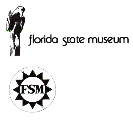
Evaluating the “Gator Head” logo
So should we keep it, update it or go for something entirely new?
Pros:
- Brand recognition, familiarity
- Speaks to natural history, including anthropology and archaeology,
- Nice tie-in to UF Gator mascot
- Friendly and accessible to families, children
Cons:
- Doesn’t convey sophistication or concept of the Museum as a collections and research leader
- Reinforces idea that we are only a “children’s museum”
- Oddly shaped; often difficult to use when designing print and electronic materials
- Fixed colors of green and copper/brown don’t easily blend with UF color logos
Next Steps
After weighing the pros and cons, we ultimately decided it was time to go beyond the gator head, affectionately known internally as “Alberto.” Museum employees and volunteers have a great fondness for “Alberto” and he has served us well, but we felt it was time for a fresh design as the Museum looks forward to its next 100 years.
In-house graphic designers Andreina Hornez Peralta and Hollis Wooley developed dozens (and dozens) of logo concepts. Communications team members whittled the designs to our top seven choices. After further internal review, the list was narrowed to two options. Following additional minor tweaks and more rounds of voting and discussion, a final winner emerged. The design then was reviewed and received final approval from the UF administration.
Design Goals for our New Identity
What were we trying to achieve?
- Clean; fresh but clear
- Recognizable
- Distinctive
- Visual appeal; stylish
- Bold
- Consistent
- Above all, FLEXIBLE
Drum Roll Please!
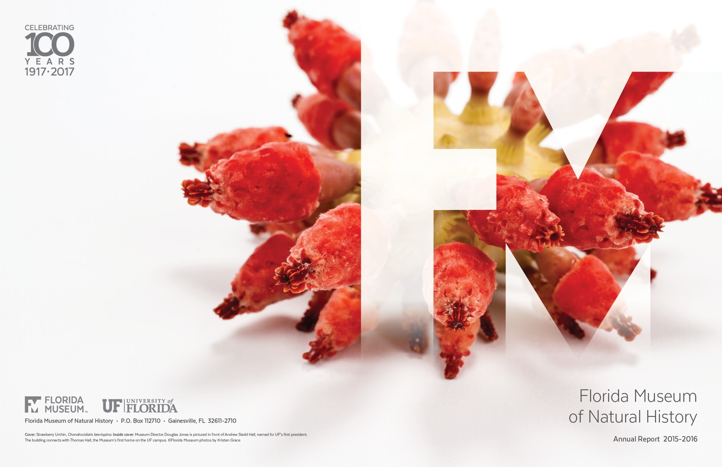
After more than two years of hard work, we have a new logo! We believe that it fulfills the goals outlined above and is an exciting new direction for the Florida Museum’s visual brand.
![]()
Trying Out the New Look
We’ve started using the new mark in many places, and have received positive feedback from internal and external audiences, including other designers and communicators. We really like the new look and hope you do as well!